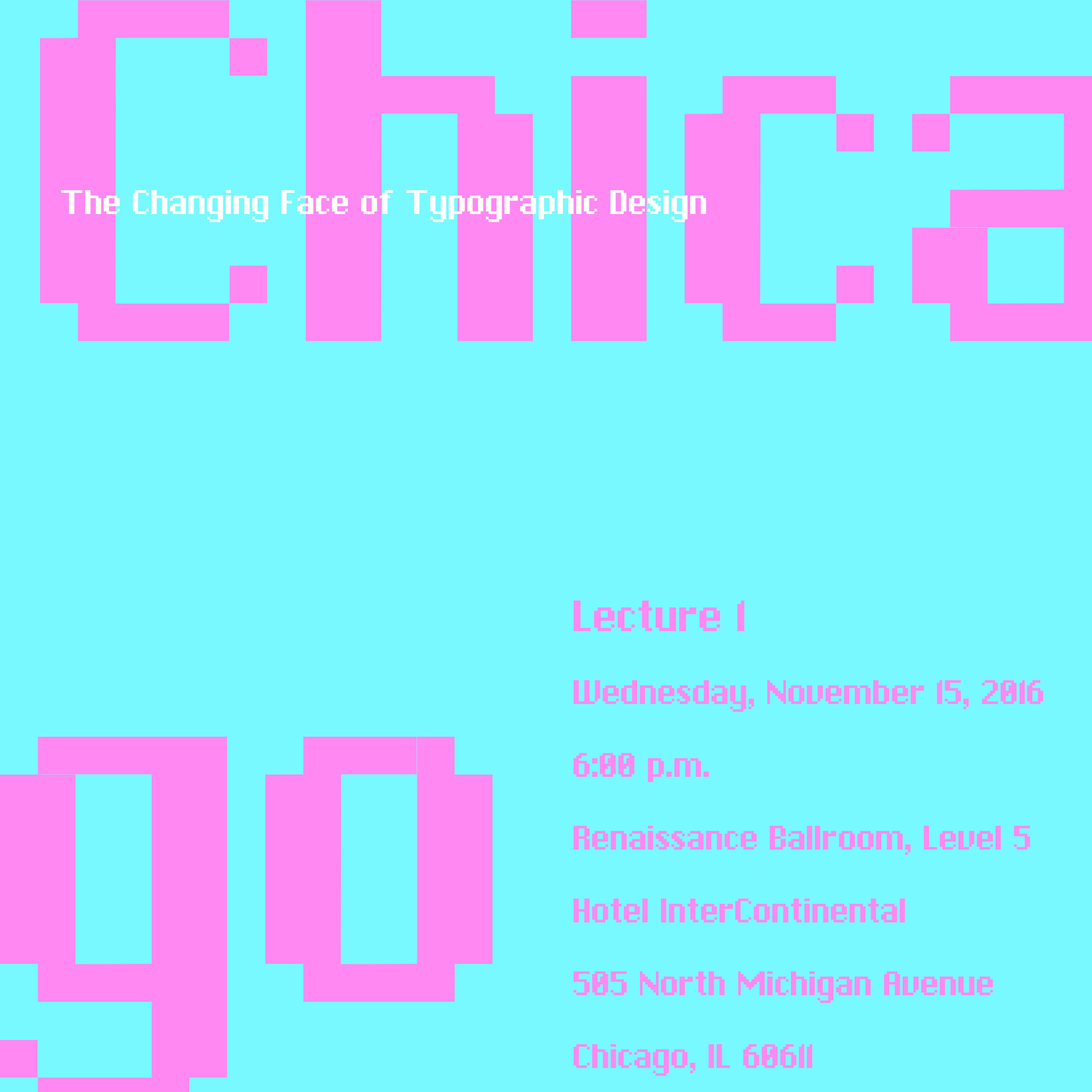
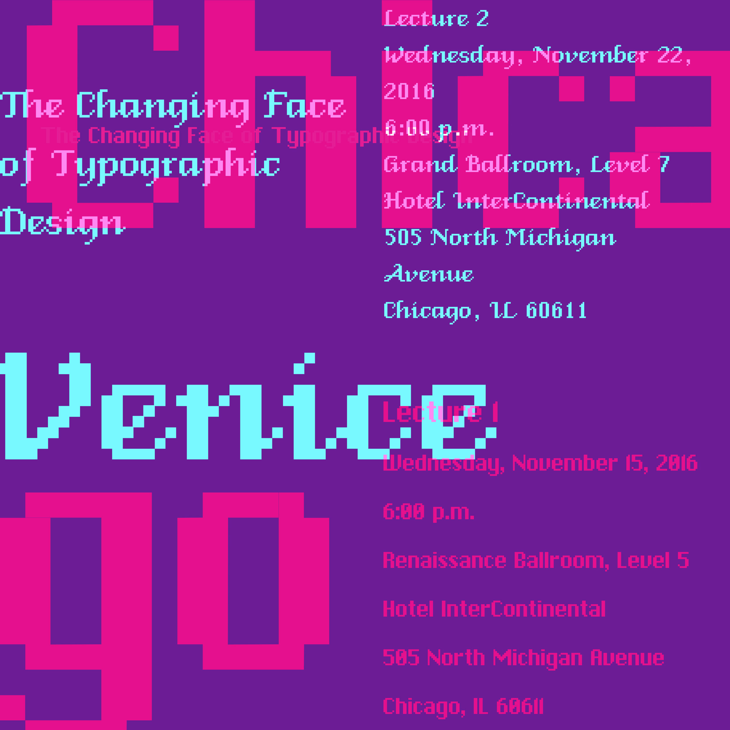
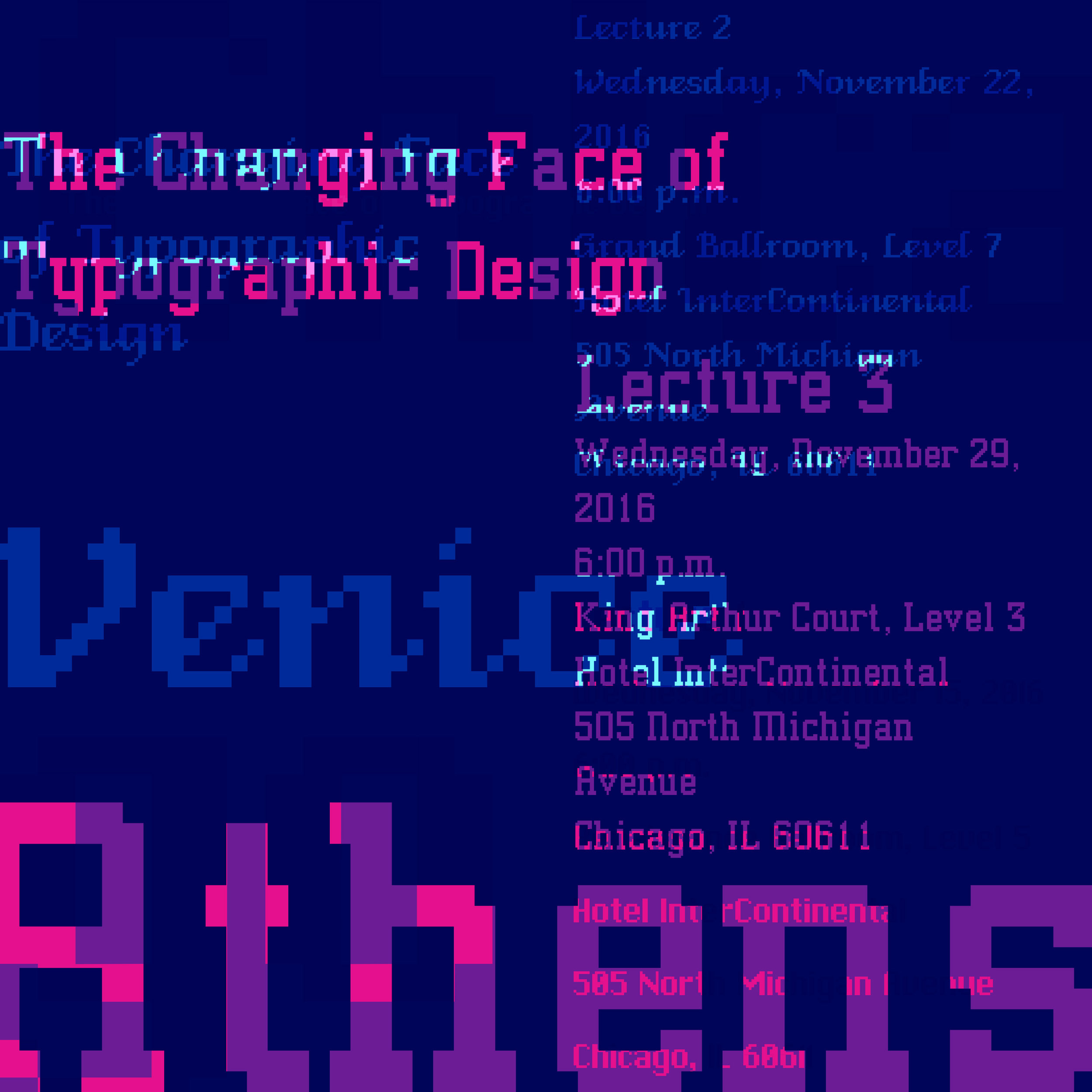
Changing Faces of Typography

Economy of Means
This triptych poster series was inspired by bitmap fonts from the 80s: Chicago, Venice, and Athens. Through the overlay transitions, I showed how each typeface is different from the other, while highlighting a lecture series. The bright colors are reminiscent of those used during this time period.